—TED Redesign
TED is a nonprofit organization devoted to spreading ideas, usually in the form of short, powerful talks. Its current website, however, is structured in an overwhelming and confusing manner and does not stand out—either visually or functionally—from other video-sharing platforms. As a solution, I redesigned the site by giving it an editorial look & feel, reconstructed the information architecture, and upgraded the visual through the use of clean typography, custom graphics, and carefully curated image assets.
project outcome
A responsive website that visually and structurally expresses TED's passion for the sharing of knowledge.
THE PROBLEM
Before going into designing and wire-framing, I conducted an analysis of TED's current website and discovered several pain points. The main issues can be summarized into 3 lacks—lack of clear information hierarchy, lack of differentiation among its diverse productions, and lack of visual impact.
The solution
For the new website experience, I wanted to emphasize on the two things TED is most known for—its talks and events. Then I packaged everything else that TED produces under the Originals page. The sitemap provides a quick overview of my redesign; areas highlighted in red indicate the pages I completed under a 10-week time constraint.
The NEW LOOK
Despite being an organization with impressive goals and productions, TED's current visual is unimpressive. It resembles your average video-streaming services and does not align with the intelligent and creative work that they generate. Therefore, I took an editorial approach to convey the fact that TED's is about knowledge-sharing, and I collected images and illustrations that would evoke curiosity and awe. I also created custom graphics that reflect TED's mission in an abstract way and dotted them throughout the new site.
LEVEL 1: HOME PAGE
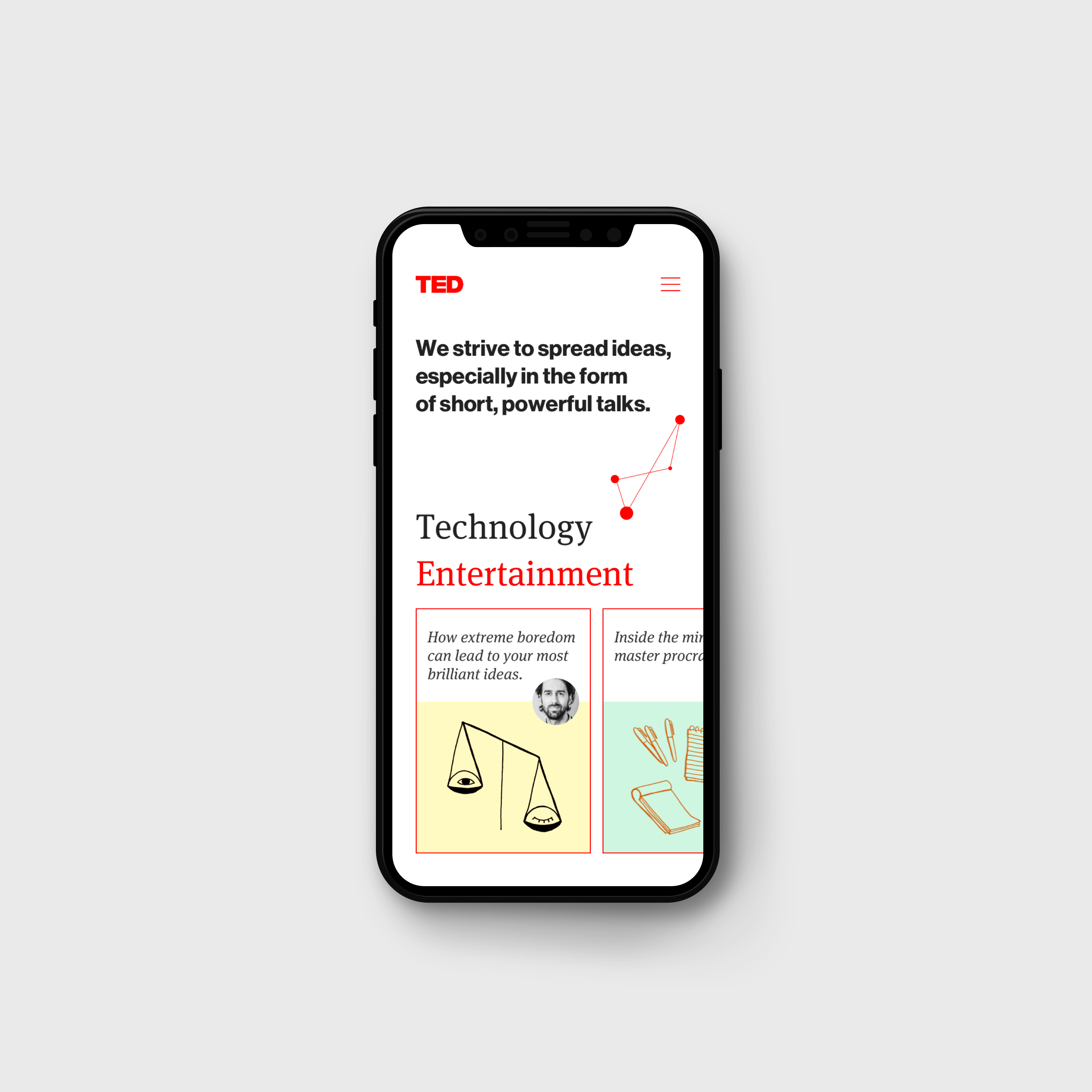
The home page was designed to capture one's attention and give them a quick taste of what TED has to offer. Instead of stuffing the audience with an overwhelming amount of content, I featured only several talks and events just to help them get started with exploring. This page also serves to briefly introduce TED with verbal narratives and visual cues, which together suggest the overall experience to be empowering, thought-provoking, and delightful.
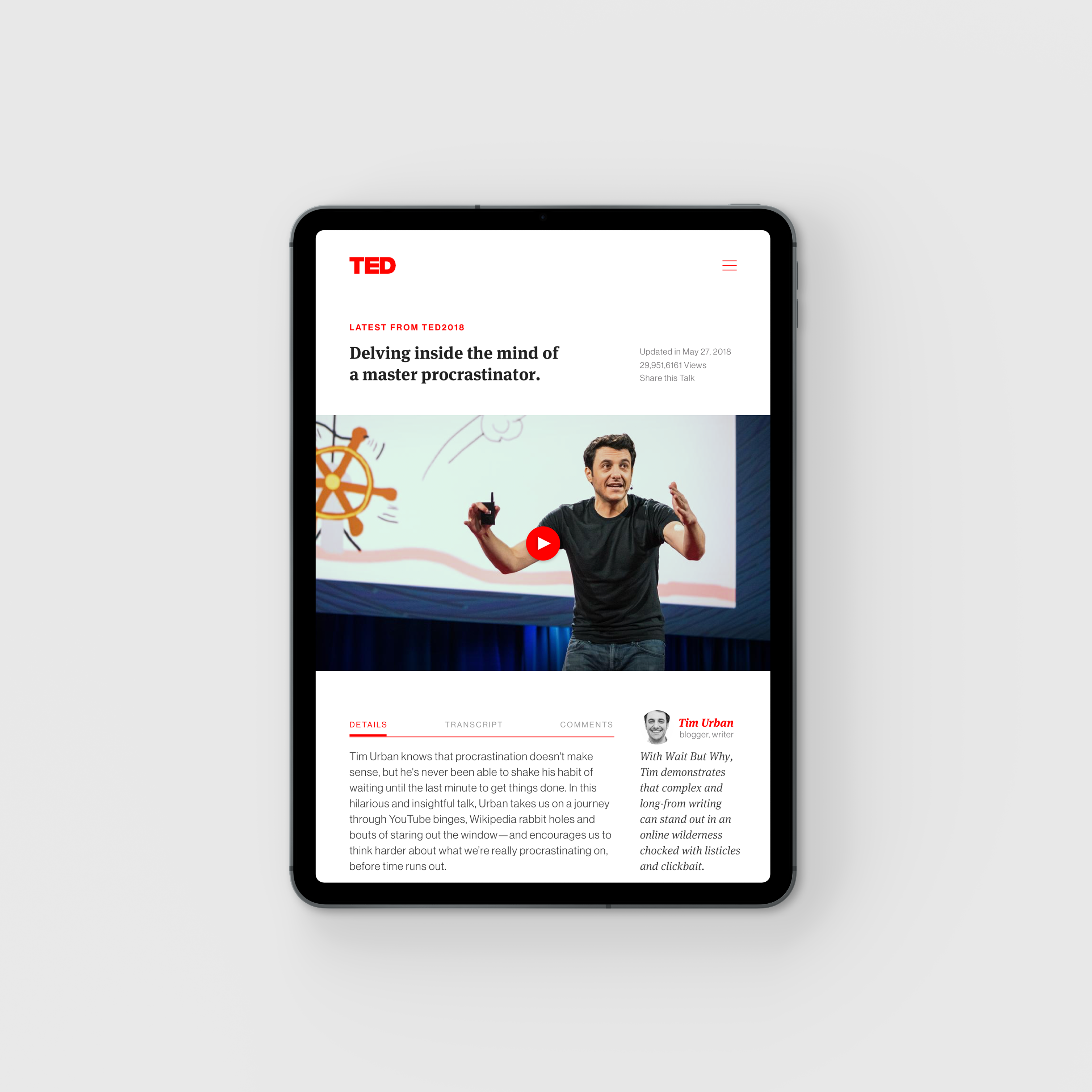
LEVEL 2: Talks
Out of the entire website, the Talks page is the most visited and regularly updated page. TED currently uses tons of categories to organize the talks, ranging from very broad terms like Design, to very specific ones like Mining. I find that ineffective and decided to group the talks under the six umbrella topics TED had formerly used—Technology, Entertainment, Design, Business, Science, and Global Issues.
LEVEL 3: Events
The Events page is where one could register to attend an event and watch (or give) the talks in person. There are two types of events and they are distinguished visually in my redesign—annual conferences organized by TED, often taking place at a global scale, and TEDx events held by independent organizers, happening frequently and locally. Intuitively, clicking on any one of the events will lead the user one layer deeper, where they could find more information on that specific event.
LEVEL 4: ORIGINALS
Besides being known for its inspiring talks and events, TED creates various materials to further educate its audience, ranging from video series, animations, original books, podcasts, and a blog. Currently, these are scattered all over the website and do not have a distinct presence. I devoted the Originals page for them since these are originally produced by TED.
REDLINING
Once the design was finished, I moved onto preparing for hand-off. I measured and marked all 6 pages—each in 3 screen sizes—to ensure that the end product will accurately reflect the design I developed.


%400.7x.png)